Reflection #4 – Mobile Research Case Study
As technology advances per Moore’s Law, the number of devices that people use will grow which will introduce more variability in screen resolution/size, processing power, and more. The problem becomes as mobile and tablet users increase, these people will expect to do more on these (sometimes) underpowered devices, including access your website. I have been lucky enough to help spearhead mobile research at Vistaprint as they set on a project to redesign their mobile experience. This post will cover everything from requirements building to conducting actual testing on an in-production site in our lab as we worked on this project.
When the business owners of the mobile site team put together a team to create a new experience, I was lucky enough to be the dedicated researcher for the team. An agency with more mobile experience was brought in to help, and the first thing that we did was to try to understand what users would need to do on this site from their phone or tablet. We did a line of contextual inquiry research, which brought us to home offices, store fronts, and anywhere our customers might have used their phone to access our site. We actually actively recruited customers who had accessed the site using the old version of the mobile experience and made a purchase. Before it was optimized it was very difficult to do anything on the mobile site, so it was amazing that people were still using their phones and still able to place an order. We learned a lot about what people wanted and needed to do, and these use cases were fairly consistent across personas and types of people.
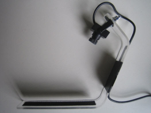
An example of a mobile testing sled that we created. Photo from “Harry Brignull’s 90 Percent of Everything”
Once all of this was completed, I sat back as the designers and developers set off to create one of many prototypes. Once there was something available to test in a prototype/dev environment, we invited some mobile users into our usability lab to see how the experience performed. This required a bit of set up on our end since we have never done this type of research before. My manager created a mobile testing sled that we had seen at UXPA Boston earlier that year. It’s simply a piece of plastic heated and bent into the shape seen on the left, with a webcam attached to the top and a platform for the phone to sit on at the bottom. This is a light piece of plastic which allows the participant to pick up the whole rig and hold the device as they usually do. To make sure the device isn’t dropped, we typically put it in a case and attach velcro to both the rig and case to keep things together. From there, the camera was plugged into a computer that sat off to the side from where the participant sits. This served two purposes; to record the session, and to allow the moderator to watch what was going on the mobile device without having to crowd over the participant’s shoulder. Outside of that, it was a fairly typical in-person session! Audio was sent over the speaker system in both rooms, the screen of the computer that was recording the mobile device was shared via Webex to alternate locations, and we allowed the participant to use the site on the device.
We did this for three rounds until the site was ready to be tested in production. At that point we had fixed many things, but still found issues that were fixed in the next release. After this first foray into mobile testing, other areas of the business wanted to make sure their products worked on multiple devices. My manager and I have done testing on all different devices for the same project to make sure that each touch-point works as the user expects. Next week I will go into more detail on how the mobile usability lab is set up, and I will provide some insight on touch gesture conventions.

Leave a Reply
Want to join the discussion?Feel free to contribute!