Reflection: Week #7 – Test Plans & Wrap-Up

This is my final post in the series of weekly reflections for my Interaction Design course.

For this last week in IxD at Kent State, we were asked to come up with a research plan for testing the prototype that we had created. Luckily for me, this is in my wheelhouse and I was excited to create something that would work for this project. To be honest, I am surprised I hadn’t written anything about this for my Usability I or Usability II courses, but now I get to share one of my favorite things to use for writing up a research plan.

Read more

Reflection: Week #6 – Portfolio Work

After a long few weeks working to prototype the Lunch Money Buddy app, I put the final touches on them to submit something that I felt would be ready for some task based usability testing. But more on that next week.

To finish off this penultimate week of the class, I took all of the work that I had done for this application, including planning items at the front end of the project, and tried to present it in a way that provided just enough detail and insight into my process and artifacts. I’ve had this website for a long time, and it’s been in and out of “construction” for as long as I’ve owned it; even though I’ve wanted to start highlighting my work I either didn’t feel I had the time or was unclear of what I could show from my previous jobs (there’s actually a really interesting AMA coming up about this). So this opportunity to actually use this site for it’s intended purpose was equal parts exciting and daunting.

I really had no idea how to potentially structure a piece like this, so learning about the PARL principle (Problem, Action, Results, Learnings) was extremely helpful. I tried to follow this format to lay out the information about this project, but I felt that without some of the business context, I couldn’t provide a lot of detail regarding the “Problem” section. The rest of the letters in PARL weren’t too difficult to complete, but as with other types of assignments I have worked on, I had to figure out how much I wanted to balance text with imagery and then make a determination around the amount of information necessary to provide a clear yet succinct picture.

Like anything else, feedback and iteration can be the key to this; I hope that the feedback people share will inform future versions of that portfolio piece (it’s very easy to update) as well as how I create future portfolio items for the rest of the work I’ve created in this program.

Reflection: Week #5 – Feedback Sandwich

Before I finish up the prototype I am working on for this class next week, the directive has been to provide feedback to others in the class. I should start by saying that I don’t think I am any good at giving feedback, even though I have been told otherwise. I think the issue is that I have a hard time feeling like what I am providing is valuable, actionable, but also constructive. The assignment did give some level of a rubric for providing feedback, but because the scope of these prototypes can be large, I felt that just sticking to that wouldn’t have provided the level of thought for a fellow classmate to actually use.

So I made sure to go through each prototype that I reviewed screen by screen, and wrote my thoughts on the layout, information, content, interactive elements, animations, and overall usability. I also tried to go through the app using a “natural” task based on the journey maps that we completed, as well as from the information provided in the personas. I ended up producing long bulleted lists, but encountered some doubt when finished:

  1. I had a lot of questions – Because there was a lot that was left open when creating these prototypes, I wasn’t exactly clear on what assumptions were made, what the imagined business rules were, and the complete vision of the classmate’s project. I tried to incorporate these into my feedback to provide an anchor in case I was off base from their intention.
  2. I had to recheck myself for tone – Communicating on the internet can be difficult, especially when you are delivering critical feedback. The idea of the “feedback sandwich” (any negative feedback surrounded by positive feedback) was never something that I thought was that effective, but I do see the benefit of calling out positive things throughout the process of critique. I wanted to make sure that I was balanced, fair, and respectful. I think I did a good job, but like with any type of writing/publishing I do, I made sure to read and re-read multiple times.

Overall, I am hopeful that my classmates will be able to take at least one thing from the feedback I provided to improve their prototypes. Now I am about to take the feedback given to me (and how I received that is probably fodder for an additional post…) and make some final changes before publishing the final version that will be ready for testing!

Reflection: Week #4 – Prototypical Prototyping?

Last week I spent a lot of time learning Sketch so that I could use a new tool to effectively turn my wireframes into something digital. This week was more of the same as I imported my Sketch files into Proto.io to try to create a very basic, first draft of the prototype that I will eventually test. What followed was a long week of trial, error, frustration, recreation, and tweaking.

Read more

Reflection: Week #3 – Sketching (But not the pencil kind…)

I’ve had the opportunity to do some wireframing in my Information Architecture classes while in the Kent State UXD program, so the thought of sitting down and putting ideas that were on paper to pixels isn’t so foreign to me. However, I’ve decided to take the sketching I did last week and try a new program to create the wireframes… can you guess which one?

Read more

Reflection: Week #2 – Sketching

In my weekly meeting with my manager at work, we chat about what’s going well, what I’m working on, what challenges I am facing, and what I am doing to try to improve the situation around them. One of the things I am working on is a wiki post about our team’s recent offsite, the learnings from the meeting, and the incoming improvements to how we work. I explained that I wanted more feedback and edits from others before I posted it, because I was sure I was missing something. He told me that I should go ahead and post anyway, that the wiki is a place where edits are made constantly, and that information is changing all the time. He recognized that we were similar in the fact that we both want to try to perfect what we are working on before we post, and while it can be a quality that serves us well at some points, we need to learn to iterate and move forward.

This may sound like a tangential story, but it applies directly to me and how I feel about wireframes. As I started sketching different screens for the Lunch Money Buddy app, I realized I was taking too much time working at perfecting the details of the individual screens and spending less time on iterating/ideating on different structures and layouts. Determining the best fidelity when sketching can be difficult, especially when I’m trying to make things look just so… even if this is not the stage to be doing that. I tried to make sure I focused more on coming up with some iterations for each screen, rather than going into the minutiae for one screen at a time.

I will say, having prefab mobile sketching templates has been a bit of a mixed blessing; while I don’t have to constantly draw a device, I think the formality of the medium has caused me to over think the process of drawing up ideas! I would love to try creating copies of my common navigation/interaction elements to create a “toolbox” of items that I can just place from screen to screen (of course, this is not unlike pattern libraries in most wireframing software). Nevertheless, I look forward to getting feedback from my team members, and putting my sketches into something more digital and refined!

Until next week…

Reflection: Week #1 – User Journeys and Site Maps

Well, I’m back at the blogging again. Just a quick update on things since we last spoke:

  • I’m in my final semester of school at the Kent State UXD program.
  • I’m at a new job; I started as a Senior UX Researcher at HubSpot in mid-January
  • I’ll be blogging weekly reflections for my last full course, Interaction Design.

This course focuses on creating a mobile application for parents/guardians to manage their children’s lunch money account. The first week of the class focused on taking the information presented in two supplied personas and an application specifications document to create User Journeys and a “Site” (probably more apt to say “application”) Map. More details on the specifications and personas can be found at the respective links (PDF).

Read more

Reflection #7 – Selling Usability

Note: This is the last post I will be writing for Usability II at KSU. I’m not sure if there will be any blogging for future classes, but this experience has certainly got me in a writing mood…

One of the biggest problems the UX industry faces is buy-in. You’d think that after over 25 years of widespread use (and I know the idea of UX has been around for longer, but really it’s proliferation didn’t begin until workplace computing took off) that the benefits and advantages of thinking about your customers would be apparent by now. But depending on where you are working and who you are working with, you could face resistance, ignorance, or downright hostility to a simple idea. And so just having passion for my work is not enough, because the passion can come off as arrogance. That’s why a finer touch is required, and it’s something that I have struggled with for a while even though I worked in places that “embraced the customer.” You will always have to convince someone, you will always need to evangelize, and you must always consider how you approach things.

The first thing to consider is that you are talking to people who do not necessarily have any knowledge of UX… but they know business and money. Now I don’t have a business background, but I know that they work I have done has had incremental impact on revenue, customer retention, and long-term value. Presenting these facts, these outputs can really have an effect on important people who are looking at the bottom line. They don’t want to know what my process is (yet), they just want to know why it’s good for the company and how it can be done with little to no investment.

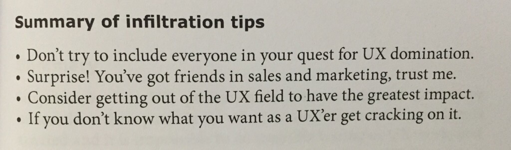
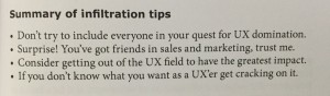
And sometimes it’s more of a political game. Being blinded by passion and the need to debate my position doesn’t help my cause when you are grappling with egos and diplomatic struggles for budget and glory. So sometimes it’s best to cut your losses and just listen. Seriously, just stop what you normally do in that situation and listen to the person who disagrees to the point where you can completely understand what they are saying and, in due time, turn it back around on them to WOW them with the results you can bring. I’ll leave you with this excerpt from the end of a chapter in “Selling Usability: User Experience Infiltration Tactics” by John S. Rhodes…

IMG_3434

I love this field. I don’t know where it’s going to take me. But I do know I want to make an impact. We’ll see how things shake out.


Reflection #6 – Eye Tracking

As the end of the course approaches, we focus on eyetracking usability. This is a methodology I’ve always thought was really interesting to try to use for a couple of reasons:

  • When you watch enough usability sessions, it’s easy to wonder if a user is seeing what is on the page
  • The output of gaze plots and heat maps can be interesting to analyze and use for presentations

However, after reading about how to conduct a study like this (“Eyetracking Web Usability” by Nielsen and Pernice is a good resource in this regard) it is clear that costs can be high for equipment, set-up, participant incentives and time to analyze the data is greater than most other usability methodologies. Additionally, this methodology is prone to errors since participants can’t move their head and the equipment can have a hard time calibrating to a participant’s gaze. Eyetracking is more valuable when standard usability testing is done enough so that a majority of issues are uncovered and fixed; at that point, the eyetracking data can be a nice supplement to find other usability concerns.

At my first job, we had a Tobii eye tracking machine but it was only used for one or two projects in my time there. The system worked well, but clients did not feel that the methodology was necessary to learn about the interface. Even at Vistaprint, we have discussed the idea of using eyetracking for various projects. The interesting part is that we can usually determine if a participant sees something in the interface or not by designing tasks that focus on specific functionality of parts of the site. At some points we ask a participant if they saw a particular item, and when they say no we tell them to look for it on the page (sometimes it’s right in front of them or over where their mouse is) and they still don’t see it! With further prodding we find out that the biggest issues lie with relevancy and user goals. If the part of the interface we are testing isn’t compatible with a user’s goals, or it isn’t relevant to what they are trying to do, they will not notice it or ignore it completely. Sometimes the issue can be that the user is so focused on their task that they don’t see anything else; the idea of selective attention applies to the web, but it is also demonstrated in this fun video involving some basketball players.

Eyetracking may help determine if a user actually didn’t see these interface elements on the site, or if they did gaze at them but did not fixate on the elements long enough to register in their brain. But first, it’s important to determine if the user’s goals and expectations align with the functions of the site and address those problems first. For the final week of Usability II, I’ll write a brief review of “Selling Usability: User Experience Infiltration Tactics” in terms of getting people to buy in to user experience and research.

Reflection #5 – More on mobile and gestures

Last week I talked a lot about how to conduct a usability study on mobile devices, since the assignment I was working on was to create a plan for how a lab could be set up to do one of these tests. Well, the assignment is done and I think it’s one of the better things I have produced in terms of practicality and usefulness to the average person who is looking to do a study like this. If you’d like to check out the “Mobile User Experience Research Project Plan: Details to set up a successful mobile usability test” document, then click the link (warning: it’s a PDF).

The rest of this week was focused on a discussion of gestures, which is one of those areas of discussion that brings out differences in opinion between technology types, designers, and those working on the user experience. One thing to consider is that we need to understand whether or not people know what these gestures are; I’d posit that we are at a place in the evolution of mobile device usage where people are being exposed to these gestures constantly and are mostly familiar with the core gestures to use their tablets and phones. This includes swiping and tapping, as well as the pinch/spread move typically associated with zooming in or out on devices. Once we find out if people know what these gestures are (again, I think we can assume this for the base gestures), we can see if they use them on whatever we are testing and what they expect them to do. This is where observation is key for both developers, who are implementing these gesture actions, and designers, who need to artfully create something that suggests interactivity with the gesture in mind.

The issue is that the technology is ever-changing and new gestures are being developed all the time. How do you introduce a new gesture into the market that will gain acceptance and widespread use? Can you accurately teach users to modify their behavior to do a gesture for a given action, and do you need to provide alternative ways of performing the action? Then, the challenge grows when you consider new input methods and the gestures associated with it like the interfaces in Minority Report, as well as the Myo armband mouse and the Leap Motion controller. But for now, these newer input methods suffer a fatal human factors flaw; I don’t know many people who can swing around their arms for hours on end without getting tired.